|
TRENDLINES
Overview
One of the basic tenets put forth by Charles Dow in the Dow Theory is that security prices
do trend. Trends are often measured and identified by "trendlines." A trendline is a
sloping line that is drawn between two or more prominent points on a chart. Rising trends
are defined by a trendline that is drawn between two or more troughs (low points) to
identify price support. Falling trend-s are defined by trendlines that are drawn between
two or more peaks (high points) to identify price resistance.
Interpretation
A principle of technical analysis is that once a trend has been formed (two or more
peaks/troughs have touched the trendline and reversed direction) it will remain intact
until broken.
That sounds much more simplistic than it is! The goal is to analyze the current trend
using trendlines and then either invest with the current trend until the trendline is
broken, or wait for the trendline to be broken and then invest with the new (opposite)
trend.
One benefit of trendlines is they help distinguish emotional decisions ("I think it's
time to sell...") from analytical decisions ("I will hold until the current rising
trendline is broken"). Another benefit of trendlines is that they almost always keep you
on the "right" side of the market. When using trendlines, it's difficult to hold a
security for very long when prices are falling just as it's hard to be short when prices
are rising--either way the trendline will be broken.
Example
The following chart shows Goodyear along with
several trendlines.
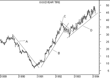 Trendlines "A" and "C" are falling trendlines. Note how they were
drawn between successive peaks. Trendlines "B" and "D" are rising trendlines. They were
drawn between successive troughs in the price.
Trendlines "A" and "C" are falling trendlines. Note how they were
drawn between successive peaks. Trendlines "B" and "D" are rising trendlines. They were
drawn between successive troughs in the price.
|